-none 화면에 보이지않음 -block 블록박스 형식으로지정 -inline 인라인 박스 형식으로 지정 => 기본적으로 width height가 지정되지 않음 -inline-block 블록가 인라인 주간형태로 지정
#box {
display: none;
}
#box2 {
display: block;
}
#box3 {
display: inline;
background-color: red;
width: 100px;
height: 50px;
margin: 10px;
}
#box4 {
display: inline-block;
background-color: red;
width: 100px;
height: 50px;
margin: 10px;
}
결과
배경속성 background
image 이미지 사입
size 너비 높이
repeat 반복 할지 안할지
attachment => 화면에 고정할거면 scroll , 따라오게 할려면 fixed
position 배경 위치를 지정한다
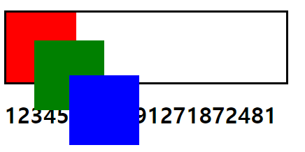
위치속성 position
absolute 위치좌표 (절대값으로 고정) 현재 지정된공간의(부모에 대해서) left: 90px; top: 90px; 위치 좌표로 지정해준다 z-index 넣어주면 z 좌표값을 지정할수 있다 순서도 가능 가장 큰 숫자가 앞으로 fixed 화면의 기준으로 절대값 relative 상대적인 위치를 설 static 위쪽 아래쪽으로 순서대로 배치
.box{
width: 100px;
height: 100px;
position: absolute ;
}
.box:nth-child(1) {background-color: red;
z-index: 1;
}
.box:nth-child(2) {background-color: green;
left: 40px; top: 40px;
z-index: 10;
}
.box:nth-child(3) {background-color: blue;
left: 90px; top: 90px;
z-index: 100;
}
body > div {
width: 400px;
height: 100px;
border: 3pxsolidblack;
position: relative;
}
결과
float 은 백그라운드는 띄우지만 컨텐츠는 겹치지 않게 한다 float : left/right 등등 img{ float: left; }
수평정렬
div.container{
overflow: hidden;
padding: 2px;
}
div.item{
float: left;
margin: 03px;
padding: 10px;
border: 1pxsolidblack;
}
<divclass="container">
<divclass="item">메뉴1</div>
<divclass="item">메뉴2</div>
<divclass="item">메뉴3</div>
<divclass="item">메뉴4</div>
</div>
이렇게 한줄로 정렬된다
overflow를 넣어준 이유는 다른 영역이 item에 침범하지 못하게 하기 위해서 넣어주었다
중앙정렬
중앙정렬은 margin 을이용하여 구현한다
margin:0 auto; 를 넣어주면된
이런식으로 글이 중앙으로부터 정렬된다
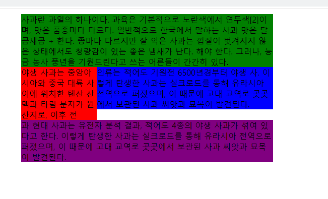
그리드 시스템
<style>
body {width: 500px;
margin: 10pxauto;}
#middle {
overflow: hidden;
}
#left{
float: left;
width: 150px;
background-color: red;
}
#right{
float: right;
width: 350px;
background-color: blue;
}
#top {background-color: green;}
#bottom {background-color: purple;}
</style>
<body>
<divid="top">사과란 과일의 하나이다. 과육은 기본적으로 노란색에서 연두색[2]이며, 맛은 품종마다 다르다.
일반적으로 한국에서 말하는 사과 맛은 달콤새콤 + 한다. 종마다 다르지만 잘 익은 사과는 껍질이 벗겨지지 않은 상태에서도 청량감이 있는 좋은 냄새가 난다.
해야 한다. 그러나, 능금 농사 풍년을 기원드린다고 쓰는 어른들이 간간히 있다.</div>
<divid="middle">
<divid="left">
야생 사과는 중앙아시아와 중국 대륙 사이에 위치한 톈산 산맥과 타림 분지가 원산지로, 이후 전 </div>
<divid="right">
인류는 적어도 기원전 6500년경부터 야생 사. 이렇게 탄생한 사과는 실크로드를 통해 유라시아 전역으로 퍼졌으며, 이 때문에 고대 교역로 곳곳에서 보관된 사과 씨앗과 묘목이 발견된다.
</div>
</div>
<divid="bottom">과 현대 사과는 유전자 분석 결과, 적어도 4종의 야생 사과가 섞여 있다고 한다. 이렇게 탄생한 사과는 실크로드를 통해 유라시아 전역으로 퍼졌으며, 이 때문에 고대 교역로 곳곳에서 보관된 사과 씨앗과 묘목이 발견된다.</div>